
• Redesign the website to help position the brand as athought-leader in the industry
• Brand refresh
• Improve traffic quality and web experience
• Increased web session duration by 40%
• 4x reduced click journey for lead generation
• Developed a web brand design system
• Created 10+ landing pages & fully responsive, funnel-focused website
• Created how-to guides, social media templates & presentation decks

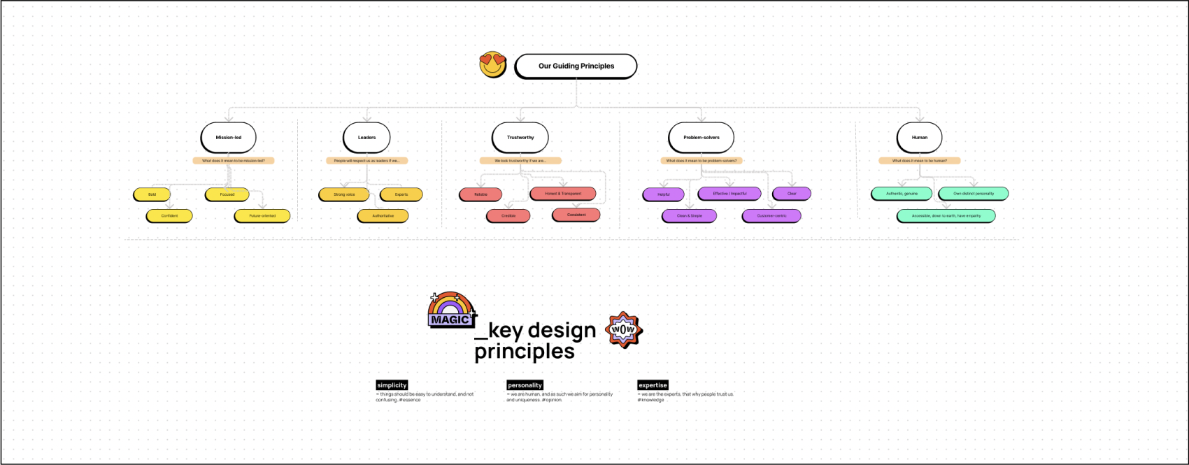
I started with a kick off meeting with the stakeholders, to understand, in detail, the vision for the company and the story they wanted to tell. They had a rough idea of what they wanted; there was already a minimum viable brand created (the logo, typohraphy, primary brand colour, brand values, etc) — but what was missing were actionable design principles that would help translate the brand into a visual language.
For that, I ran a lightweight branding exercise, to narrow down those ideas into actionable design principles. We came out of this activity with three clear design principles:
During the workshop, the story behind the name of the company emerged: turns out, it’s a word pun. As the world is “on the brink” of climate disaster, Briink is here to connect the dots (therefore “ii”) between finance and sustainability. The word ‘brink’ reminded me of sharp edges of the square and the triangle. The half-ellipse has already been an established element of Briink’s brand universe, so the client wanted to keep it, whereas the circle is a unifying, balancing element to it all.
For my inspirations, I went to and created multiple boards. There, I was seeking inspiration on simple forms and geometric patterns, as well as simple black & white ideas with a lot of breathing space and splashes of colour.

Now that I had all the information necessary, I started off with the sitemap redesign. As Briink is still a growing start-up, I needed to keep the sitemap simple and straightforward, making sure that it would be easy to build upon it in the future as the team develops more content. I also used the sitemap to check in with stakeholders so that they have clarity over the future inrastructure of their website.

I then proceeded with layout exploration, creating several layouts, taking things in and out and combining what I liked, until I was getting the overall feeling for what felt right.

Focusing on product storytelling, visitors were now actively assisted in understanding the benefits of the product and getting a comprehensive idea about its benefits and cutting-edge capabilities. Through delightful micro-interactions ✨ we allowed users discover more content on hover states, thus also actively engaging with the website.
There were also significant optimisations done to pages like the About page: while it got 90% shorter in the new design, it had additional sections (e.g. Partners and PR) which added extra credibility to the young company. In addition, the click journey on the Contact page was also reduced by 4x times.
Following the atomic design system ⚛️ methodology, which uses nested components, I defined and organised all components on atomic level (e.g. text styles, colours), molecular level (e.g. buttons), organisms (e.g. navigation), and modules/layouts. This made it easy for the developer to build the website and build a component library on Webflow. The design system also allows to scale in the future.


